I completed 2 of my studio modules at college. Both of these involved creating a final piece based on any area of studio photography that I wanted to explore. And both times I chose advertising. The first time, simply because I hadn't done it before and so it was a challenge to see if I could produce something that stuck to the conventions of this genre of photography. I was so pleased with how that image turned out hence why I chose advertising again for the second module.
You may have seen this image in a previous post. I took it in my first year at college and it was displayed at the end of year exhibition.
Anyway, for the final piece, we had to write ourselves a brief as if it was from an external client and then fulfil it. I wrote a brief from Coventry city council requesting and image to be used for a poster campaign encouraging primary school age children to drink milk. My solution to this was to make the milk bottle look more attractive by decorating it in some sort of crazy way and photographing it in a simple set up.
Before shooting I did a fair amount of research, looking at existing images used for advertising, which helped me to decided on the look of my image. I decided to go for a spot light on the background to highlight the iconic shape of the milk bottle and the reflective surface to give the image depth.
And as for the decoration of the bottle, I came up with a couple of options. The first one I covered in furry cow material and the second I painted in on a cow pattern in crazy colours.
I think that the fur covered milk bottle works best as the graduating tones in the background works better with the black and white pattern.
Working out how to light the background was a trial and error process as I knew what I wanted it to look like but I wasn't really sure how to achieve it.
I started off trying to light it from an angle by positioning the flash head with a honey comb reflector to the right of the camera. However this caused the light to fan out (hmm... is that the right phrase?) so I tried replacing the reflector with a snoot to try and create a more directed beam of light.
This did create more of a spot light but not in the centre of the background. So I then went back to the honey comb reflector, brought the light stand down as low as it would go and place it in the middle of the frame so it produced a circle of light where I wanted it.
I just had to be careful to make sure I placed the milk bottle so the flash head was hidden behind it!
And so this is the final images I presented for my final assessment. I was so pleased with how this came out that it inspired the composition for my college FMP.
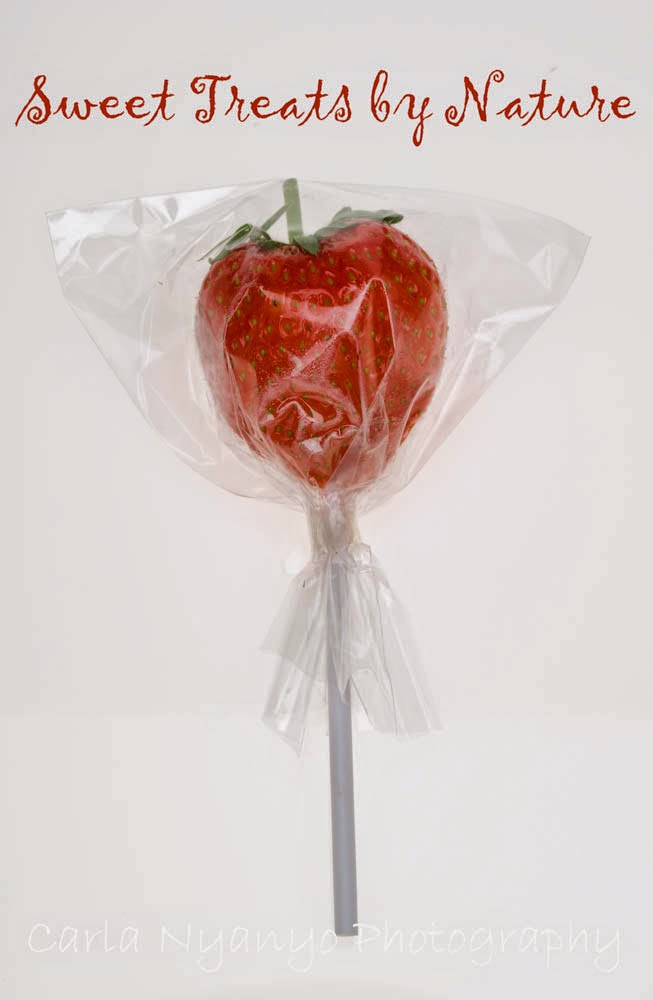
The second studio advertising project I did was a continuation on the theme of getting school kids to make healthy choices by turning fruit into sweets. (It sounds like I have an obsession with healthy eating- really, I don't)
For this I used a scoop background which I back lit with a soft box in order to get it nice and even.
The slogan "Sweet Treats by Nature" I came up with myself. Lets face it, it's not the best but then my main concern was the photography.
I had some problems with the lighting. Because most of fruit I was photographing was surrounded by transparent materials, when I had the correct exposure to make the background pure white the subtle details in the clear wrappers and glass sweet jar were washed out. In the end I worked out a system where I lit the background partly from behind and partly from the bottom. Although the end result is not pure white, it is an even tone of white and all the details are still visible so I felt this was a good compromise.
I found working with fruit soooo much more difficult than I thought it would be! Firstly (and probably most obviously), fruit is perishable. I did 5 test shoots working out the lighting, plus a final shoot which meant I had to buy 6 lots of fresh fruit. And secondly, fruit is soft and so I had some issues dressing it up, especially wrapping the raspberries. You can probably see in the image above that it's starting to leak.
Overall, I'm not sure I completed this project to the best of my ability. I think I had a good idea but my execution still needs some work. Maybe if I'd had time to review again and do another shoot the final images would be more refined.